Today’s post is by author and website designer Camilla Monk.
How’s your press kit doing these days? Mine was virtually non-existent until I attended an excellent presentation on author press kits hosted by agent Sarah Fisk for the Authors Guild. Sarah’s insightful and actionable advice led me to reflect on what sort of press kits I—and by extension the bloggers and journalists looking to write about authors and their books—see online: mostly downloadable PDFs with low quality images and limited content.
In other words, the very medium we rely on to advertise our books is, more often than not, useless. Journalists and bloggers will find it easier to harvest whatever they can from your website than download your press kit—unless you turn it into an invaluable tool box for the hurried journalist. Here’s how:
1. No PDF
In the name of all faceless interns trying to glue together an online news article at the last minute, please don’t use a PDF.
- Copying text from a beautifully designed PDF file can quickly turn into a headache if the pasted contents end up looking like a mangled soup of words.
- Images in PDF files are compressed and difficult to extract. Should they screen capture, crop, and export? Convert the PDF into a docx file, then export the images? All terrible solutions that will make bloggers and journalists secretly hate you a little as they struggle to snatch a low-quality pic of you.
So, if you’re not doing an online press kit as I recommend in point 2, go for a simple Word document and make everyone’s life marginally easier. You want people to distribute your materials widely: make it easy for them.
2. Have an HTML-based press kit at your website
A well-constructed HTML page at your website is quite simply the easiest way to share both text and images at various resolutions with your visitors. Set up a page where you’ll gather all the information and offer downloads of any relevant materials (sample, photos, and maybe a docx version of your kit’s content for users who simply can’t work any other way.)
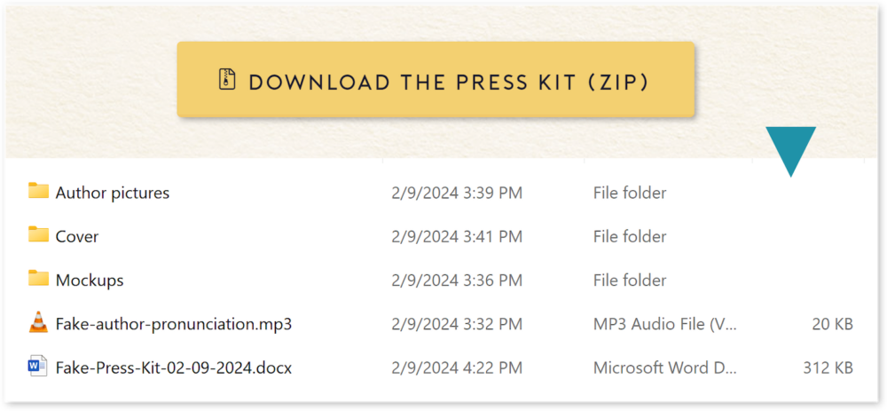
Alternatively, or additionally, you can offer a zipped download of your complete kit, with the text content as a Word file, and subfolders where your media content will be organized and clearly labelled, for example: Media/Author pictures/Jane-Doe-High-Res.jpg
Steer clear of advanced design on your press kit page: you want text that’s easy to copy and doesn’t come laden with unnecessary colors and fonts.
3. Make your kit exhaustive but not exhausting
Here, I’ll direct you to Sarah’s most excellent and fairly exhaustive Press Kit Checklist. Read it attentively: you might find items you’d never thought of adding, or never even heard about. More than just a checklist, it’s a great introduction to building your marketing platform at large.
Book club questions, games, fun facts, Q&A? Not everything in this list is relevant to you or your title. Try to pick wisely and not overcrowd your press kit with material that might provide very little value to the media.
The first criteria for any piece of your press kit should be: How does this meaningfully relate to my book? And the second is: How does this contribute to building my professional image?
Note the nuance in the latter: The point is not just to talk about yourself, but rather to construct an image of yourself as an author. Say that you’re writing women’s fiction: anecdotes about your family life and career struggles are relevant not only to your books, but also to the image you want to project to your readers, someone women and parents can relate to. If, however, you’re writing a spy thriller or epic fantasy, this information becomes a lot less valuable and may unnecessarily crowd your kit.
4. Build a solid media gallery
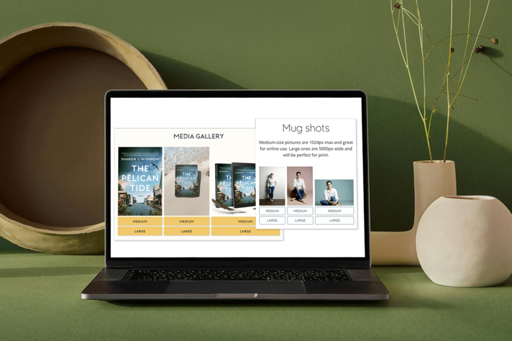
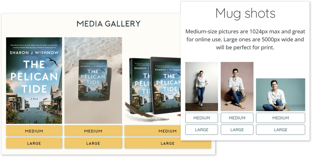
You want that book cover and your author headshots to circulate, so help bloggers and journalists do their job!
Include a full gallery of author pictures, cover images, and book mockups. These can be real shots of your books taken by a photographer, or images you generate with online software like Canva, Placeit, or Smartmockups. (This list is not exhaustive.) For each image, make sure you’re offering both medium and high resolution: online journalists may want a lighter image that they can quickly upload, whereas YouTubers or print media will prefer high resolution materials.
Consider a mood board as well: a collection of high-resolution, royalty-free images that paint the atmosphere of your book. Reviewers will love to tap into those to illustrate their social media posts or videos.
As I mentioned earlier, make sure to clearly label each image and describe what it is, and its resolution (low, medium, or high.)
5. Don’t forget samples and ARC links
Whether you’re traditionally or self-published, you probably have samples of your book (and audiobook, if applicable.) Don’t forget to include those, along with links to Advance Reader Copy platforms like Netgalley, if applicable, to encourage any visitor to read and possibly review your book. Again, the name of the game is to make it easy for anyone to click and find more.
6. Lastly, stand out with copy buttons!
It’s such a simple and silly trick and I can’t believe it took me listening to Sarah to think of this. Your press kit targets media who might write about your title on a variety of media platforms: articles, reviews, YouTube videos, etc. They need to work fast and efficiently, and part of their job entails painstakingly copying material from your kit.
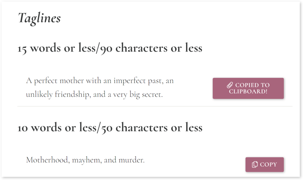
So why not make their job ten times easier by dividing your content into sections, each coming with a “copy” button? Want a brief description or tagline to open your review? BAM. It’s done.
This doesn’t require advanced tech capabilities. Here’s an example of what it looks like:
TL;DR: Make it easy for everyone to propagate your press material
This list is not exhaustive, and you might come up with great ideas of your own on how to make it simpler for reviewers and the media to find and use the material they need. Ultimately, that’s all there is to the art of making a press kit—put yourself in the intended user’s shoes and ask yourself:
- Is this relevant?
- Is this easy to find?
- And is it easy to use and distribute?
Camilla Monk spent over a decade in advertising, building rickety websites for financial companies before she turned her wiles to writing. She has since traditionally and self-published a six-book romantic suspense series, Spotless, as well a three fantasy titles. These days she shares her time between writing more high-octane nonsense and designing websites for book industry professionals.

